

meta data for this page
Smart Nodes for Charting
This type of Smart Node offers the unique possibility to display the content of a view by using a diagram. This makes it possible to display the often complex architecture of views in a more comprehensible and clear way.
Where to find Smart Nodes for Charting
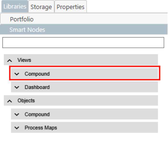
- Smart Nodes for Charting can be found in the Smart Node library in the
Compoundtab of theViewscategory. - If you open the Compound tab, you can access a wide range of chart types directly from the Library.
- If you want to learn more about the general use of the Smart Node Library, click here.
Structure
In the following section, the basic structure of Smart Nodes for Charting is explained in more detail.
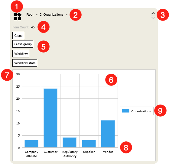
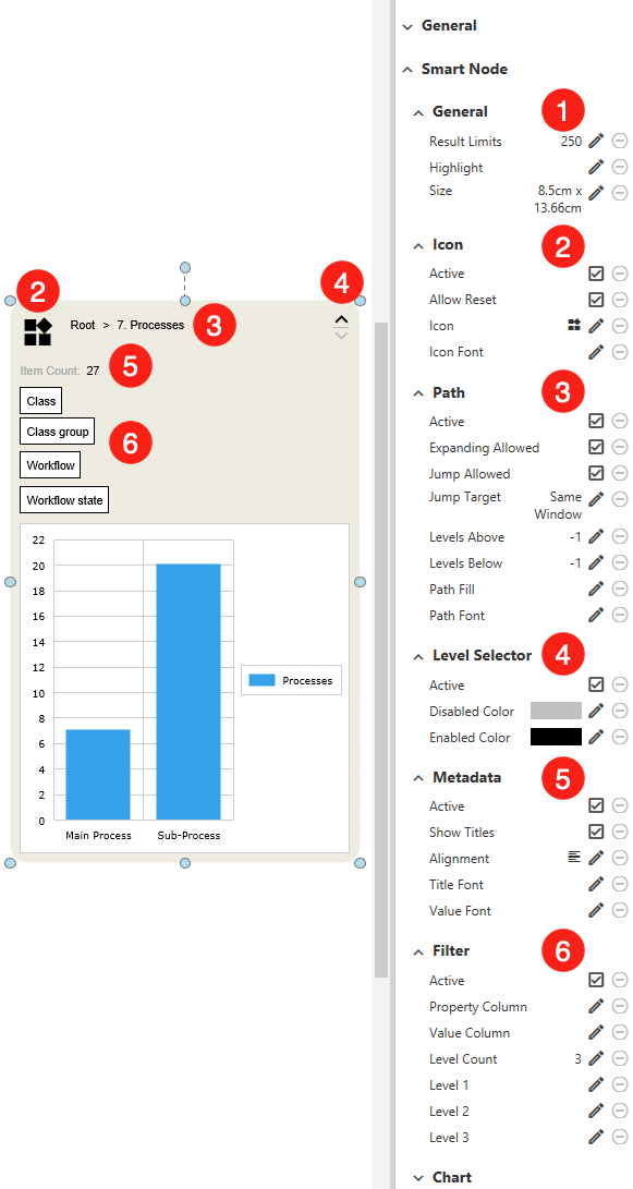
- Icon - Besides the aesthetic added value, the icon also brings an important function. By default, the Smart Node can be reset to its original state with a click on it. This is especially useful if you are using a highly subdivided view that you want your users to browse.
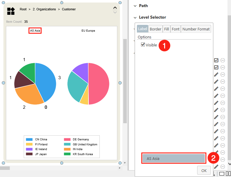
- View Path - The specific path of the connected view in hierarchical breadcrumbs. By default, a user can move through the different levels of a view. This can be done by clicking
>. - Level Selector - These buttons can be used to open
∨or close∧the Smart Node. In case either the maximum or minimum height of the Smart Node is reached, the affected button will change its color. - Item Count - Number of items the connected view contains.
- Filter - In the filter area, the query of the selected M-Files view can be limited. By default, the properties
Class,Class group,Workflow, andWorkflow stateare displayed first. If a property is selected, the associated values appear next to it. - Legend - The legend describes the data series by which the objects of the view are sorted.
- Category Axis - Displays texts (Properties) according to which the individual elements are grouped together.
- Value Axis - Here the numerical values (in most cases the quantity) of the properties are displayed.
9. Charting Area - The main section of the Smart Node. This area displays the elements of a view that have been processed into a chart. The display of this area depends on the selected charting type. When you hover over a section of the chart, a tooltip opens listing the individual M-Files objects. This listing offers you the following interaction options:
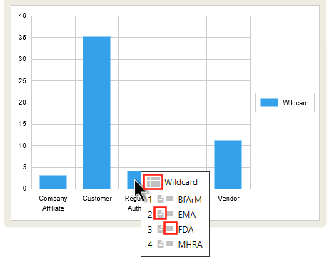
There are at least three interaction options for each object type.
- Trigger a search that results in the display of all related elements.
- Open the meta data card of a specific element.
- Trigger a search that only results in the display of one specific item.

When you select a document, and you have the appropriate rights for it, you also have the option of editing and viewing it.
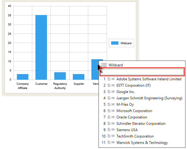
If a category contains more than ten M-Files objects, a search bar is displayed by default in the tooltip, which allows the user to search specifically for contained objects.
Note that if brought onto the canvas, a Smart Node for Charting will be equipped with a so-called RAW data set. This is sample data that is randomly calculated when it is being dropped. This way, before the Smart Node is linked to a view, the chart type is visible right away.
NOTE: Since there is a wide variety of possible changes that can be done to the appearance of the chart, the position of certain elements might vary. For example, some chart types swap the positions of the category and value axes (Funnel) or completely disable them (Gauges). Please note that the example used here is not accurate for all charting types. However, other examples are explained below.
Customizing the Smart Node
When a Smart Node is selected, adjustments can be made using the Properties menu on the right. This section is about customizing the Smart Node, not customizing the chart area. If you need more information on this, see the following section.
1. General
- Result Limits - Define the maximum number of objects to be displayed in the selected Smart Node. In order not to overload your Vault, a limit of 250 is set by default.
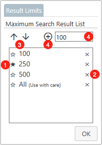
- Value Container - This container holds the values that are currently available for the user to choose from. If a value is clicked, it will be set as default. This is indicated by the filled star
★in front of a value. Please note, to display the changes, you have to close the dialog by clickingOK. - Delete Value - If you want to delete a value from the selection list, you have to click the cross next to it.
- Move Value - Move a selected value either one position up
↑or down↓in the list. Please note that the position in the list is also applied to the filter on the Smart Node. - Add Value - To add a value, please enter the desired amount in the field to the right of the icons. To add the value to the list,
+must be clicked.
2. Icon
- Active - If the display of an icon is undesirable, this can be deactivated here.
- Allow Reset - Here you can switch on or off whether the Smart Node should get back to its original state when the icon is clicked.
- Icon - A click opens a list of possible icons that can be freely selected according to your needs.
- Icon Font - If you want to change the size or color of the icon, this menu item can help you. Similar to labels, you can personalize the appearance of the icon here.
3. Path
- Active - If you do not want the name of the path to be visible, you can disable it here.
- Expanding Allowed - If it is undesirable that the user can move freely through the individual levels of a view, this function can be disabled here. This way you can define a fixed view that is inseparable from the Smart Node.
- Jump Allowed - Here you can specify whether the view should be broad up when you click on its name.
- Jump Target - If the previous item is enabled, you can specify here whether the view should be opened in a new window or in the same one.
- Levels Above - Set whether and how many previous levels of the selected view should be shown.
- Levels Below - Similar to Levels Above, except that here the underlying levels are addressed.
NOTE: If you set both previous menu items to -1 , the user will have access to any number of levels below and above the deployed view.
- Path Fill - This menu item can be used to specify a color tone with which the view path is to be highlighted. By default, the field
Noneis selected. To make more colorings selectable, this field must be clicked first. - Path Font - As with any other label, it is also possible to customize the way the Smart Node label is displayed. If you need more information on how to customize the font of texts, you can find more information here.
4. Level Selector - Here you can customize the appearance of the buttons to expand ∧ or shrink ∨ the Smart Node.
- Active - De-/Activate the functionality.
- Disabled Color - A button is deactivated when the Smart Node can not be expanded/shrank in its direction. The color it should assume in this state can be set here.
- Enabled Color - Conversely, if a Smart Node can be expanded/contracted in the direction of the button, it also takes on a specific color. This color can be determined here.
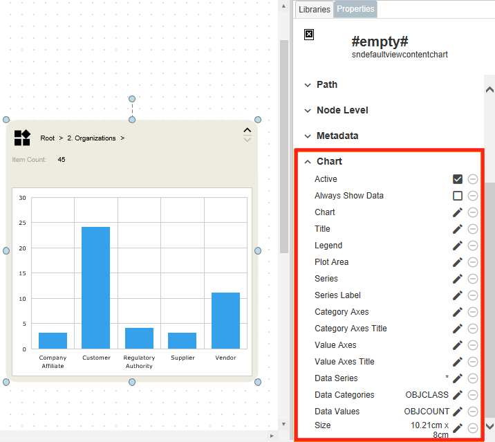
5. Metadata - The term Metadata refers to the section of the Smart Node which shows the number of items included in the selected view. The following adjustments can be made via the Properties menu:
- Active - In case the amount of metadata is irrelevant to your users, you can make it invisible here.
- Show Titles - Here you can define whether the text 'Item Count' is to be displayed or only the number of objects is to be listed.
- Alignment - This menu item gives you the possibility to select the alignment of the
Item Count:…: Left-aligned, centered, or right-aligned can be selected. - Title Font - Of course, the display of this text can also be personalized. The process is the same as already described above.
- Value Font - Same functionality, but for the number of contained objects.
6. Filter - Customize the filter area according to your personal needs.
- Active - De-/Activate the functionality
- Property Column - This entry contains settings for the customization of the property columns:
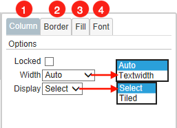
1. Column - Customize the functionalities of the column. Due to the wide variety of its options, they will be covered in more detail.
- Locked - If activated, the property columns can not be expanded. This can be helpful if you want to specify a certain property for your users, which should always be used for filtering.
- Width - Defines how the property columns should behave if the property title is longer than the width of the field. Auto: Titles that are too long will get a line break. Textwidth: The width of the field adapts dynamically to the length of the title.
- Display - You have the choice of how your personal properties should be displayed. Select: You choose your properties from a scrollable list. Tiled: The properties are displayed as a clickable tile.
2. Border - Select the color of the border of the column.
3. Fill - Set the color of the column's background.
4. Font - Determine the font style and color of the displayed properties within the filter.
- Value Column - All the settings described above for the property columns are also applicable to the value columns.
- Level Count - You have the possibility to set as many filters as you like for this Smart Node. Simply enter your desired number in this field.
- Level - Depending on how many filters you have set with the previous menu item, the number of these entries will change. Here you can define which properties and associated values appear in a specific filter row. When clicked, a list of all possible properties defined by your vault will appear.
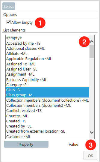
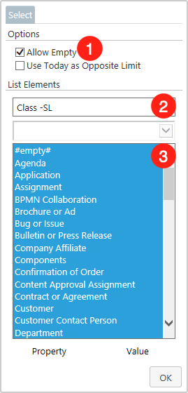
- Allow Empty - Determine if the property
#empty#should be displayed in the list. - List Elements - Specify from which properties the users can select later. All properties with a blue highlight are accessible via the Smart Node. This option is especially useful if you have previously selected Tiled as the display format.
- Value - With a click on the entry
Value, you can restrict the values which are associated with the selected properties. The dialog is shown in the following picture.
- Allow Empty -Determine if the entry
#empty#should appear in the Value List. If a user selects#empty#as a value to filter by, only M-Files objects that contain the previously selected property, but do not have a value set for it, will be considered.
- Property Selection - If you have specified multiple properties for a filter, you can select here for which you want to limit the values.
- Value List - In this list you will find the corresponding values for the selected property.
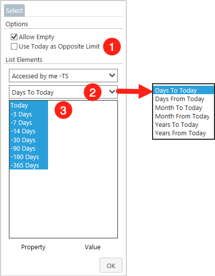
Apart from that, there are some peculiarities when you have selected a temporal property. This can be, for example, the creation date, last edited or due dates of certain projects. More generally speaking, this concerns every property of the type TS (Timestamp) and D (Date)
- Use Today as Opposite Limit - If this option is enabled, the filter selection will be limited to dates in the future (Days From Today) only. This should be applied if you are looking for e.g. future due dates of projects or expiration dates of legal documents.
- Time Interval - Determine in which time intervals you want to filter. Basically, you should know that today's date is always taken as the starting point. Furthermore, we distinguish between the possibilities to filter
To, orFromtoday's date.Tomeans that an interval is formed into the past. This should be used to search for e.g. publication dates of documents.From, on the other hand, builds an interval into the future. This is useful e.g. if you have selected due dates of projects as property. Besides days, you can also filter by months or years. - Time Period - Depending on the interval you have previously selected, you can see here the exact period of time that users can filter by. Like conventional values, these can also be limited.
Customizing the Charting Area
The customizations that influence the charting area directly are done via the Chart section in the properties menu. Clicking on one of the pen icons opens a window with numerous customization options for the respective menu item.Since each menu item offers a variety of personalization options, each of them will be treated individually in the following.
Apart from that, the first two menu items are kept rather simple:
- Active - If the displaying of the Charting area is undesirable for you, you can disable it here.
- Always show Data - Normally, only the elements that are directly in the selected view are being processed into a chart. If there are sub-views in it, elements lying in them are not considered. If this menu item is activated, all elements of the underlying views will be displayed.
Note: Since we have limited the maximum number of elements to 250 by default, not all elements may be taken into account. To change this, you can change the limit in the General section.
Chart
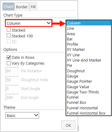
- Chart Type - Although you can select a suitable chart type in the library, you can also change it afterwards in the properties. You have the possibility to choose from 18 different chart types. Among so many, there will be one that exactly fits your field of application.
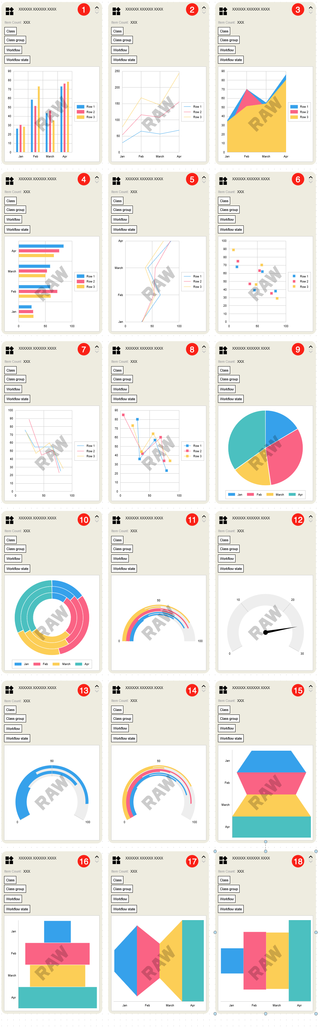
- Column - This chart type is particularly suitable for comparing values with each other. Based on the height of the individual bars, a clear comparison of individual criteria can be created quickly and easily. No prior knowledge is necessary to understand the core statement of a Column chart.
- Line - The Line Chart is mostly used to show changes over time. Widely used fields of application are for example: annual earnings, number of orders over the years, number of employees, etc.
- Area - The Area Chart is closely related to the Line Chart. The only difference is that the space between a line and the horizontal axis, or an underlying line, is filled.
- Bar - The Bar Chart is basically a Column Chart tilted 90 degrees to the right. Therefore, it is suitable for the same areas and has the same advantages.
- Profile - The Profile Chart is also an optical modification. In this case, the Line Chart has been tilted 90 degrees to the right. The characteristics of the Line Chart also apply here.
- XY Marker - The XY chart (also known as scatter chart) uses markers to represent two different numeric values. They are mainly used to represent relationships between two variables. An example of use is the relationship between the number of product sales and their profit.
- XY Line - In principle, this type of chart behaves like the XY marker. However, here no points but lines are used to display the course of values.
- XY Line and Marker - The combination of the two chart types described above. Here, the individual values are precisely marked with points, but these are also connected with lines.
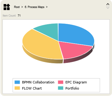
- Pie - When the Pie Chart is selected, either one or more circles are formed, which are divided into segments. This makes it easy to see the relationship of objects to the entirety of a category. Another characteristic is that the Pie Chart does not require axes for orientation.
- Doughnut - Doughnut charts are quite similar to pie charts. One difference is, however, as the name suggests, there is a hole in the middle of the chart. Generally, data can be presented more clearly this way, since you are not focusing on the center of the chart, but on the ratios at the edges. The free space in the middle can also be used to place useful information in it.
- Gauge - Basically, this is a semicircle on which various values can be displayed by means of lines. The principle is similar to the Doughnut Chart.
- Gauge Pointer - This chart type should be used especially for single data values. Here, a pointer in the middle of the chart is used to convey data values in a simple and understandable way. A popular use case is e.g. the evaluation of customer satisfaction.
- Gauge Value - Similar to the Gauge Chart, except that the different data categories are not separated by color.
- Gauge Two-Thirds - Has the same functions as the Gauge Chart, only this type starts at a different angle.
- Funnel - The name Funnel finds its origin in the fact that the chart is intended to start with a wide head and become narrower towards the bottom. The transitions between the individual phases are displayed smoothly. It is used to visualize the progressive reduction of data as it moves from one phase to the next. Business processes such as the acquisition of new customers are particularly suitable here.
- Funnel Box - The only difference to the Funnel Chart is that here the transitions do not merge into each other.
- Funnel Horizontal - Another way of displaying the funnel chart, which has been tilted 90 degrees to the right.
- Funnel Horizontal Box - A different way of displaying the funnel box chart, which has been tilted 90 degrees to the right.
In addition to the option to specify a chart type, numerous other settings can be made in the Chart dialog.
NOTE: Depending on which chart type is selected, the further options differ.
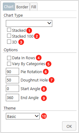
- Stacked - Normally, different properties in a column or bar chart are displayed next to each other on the Category Axis. By activating the stacked function, properties of a Category Axis section are displayed as one bar. These are then divided into sub-bars. This is especially useful when you are interested in the relative composition of a category. Line and Area Charts can also be displayed as stacked. If selected, the values of the individual Lines are displayed cumulatively on the individual points of the Category Axis. Their values are therefore added up at each point. This option is accessible for the chart types: Column, Line, Area and Bar.
- Stacked 100 - Similar to the previous entry, different properties of a category are displayed on top of each other. However, no absolute numbers are displayed on the Value Axis, but a scale from 0% to 100%. Only the percentage ratios of the individual properties in a category are taken into account. This option is accessible for the chart types: Column, Line, Area and Bar.
- 3D - This option can only be applied to a Pie chart. If you activate this option, your Pie Chart will be displayed three-dimensionally.
- Data In Rows - If Data in Rows is deselected, the values of the category axis and the legend are swapped. This option is accessible for every chart type.
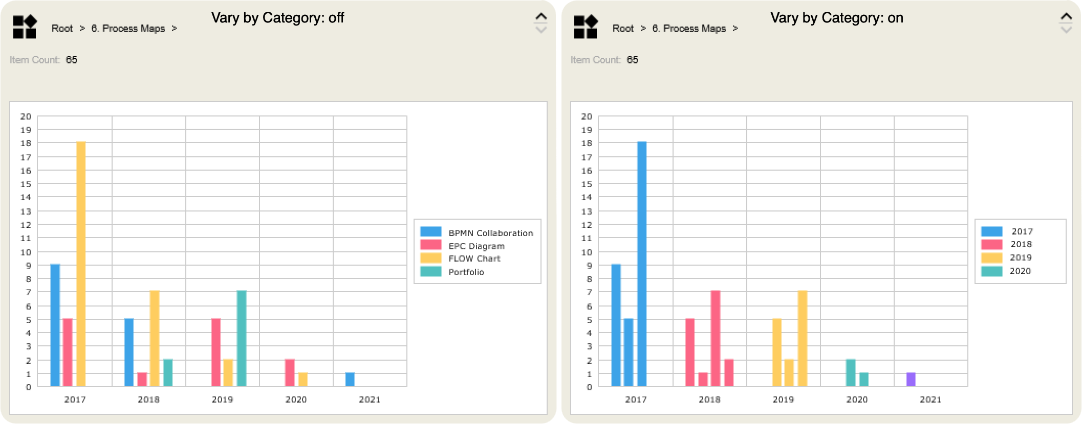
- Vary By Categories - By default the individual properties of the series are marked by different colors. If you prefer to shift the focus from the Series to the categories, you can activate this menu item. In this case, the colors of the Series of the same categories are aligned and can be better distinguished from each other. This option is accessible for every chart type.

- Pie Rotation - This option can only be applied to a Pie chart. After selecting the three-dimensional display, the tilt of the graphic can be set here.
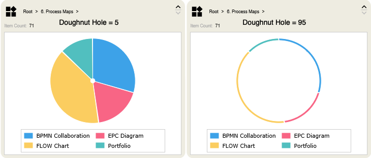
- Doughnut Hole - This option is limited to the Doughnut, Gauge, Gauge Pointer, Gauge Value, and Gauge Two-Thirds chart types. All the chart types just mentioned have in common that they have a free area in their center. Here you can set the size of this area. Values between
5(smallest) and95(largest) are accepted.
- Start Angle - This option is applicable to the Doughnut, Gauge, Gauge Pointer, Gauge Value and Gauge Two-Thirds chart types. Specify at which angle the chart should start.
- End Angle - This option is applicable to the Doughnut, Gauge, Gauge Pointer, Gauge Value and Gauge Two-Thirds chart types. Specify at which angle the chart should end.
- Theme - Change the color scheme of the charting area. This option is accessible for every chart type.

NOTE: The following editing options are available for every menu item. Since otherwise, it would come to repetitions, these are treated only in this section.

- Border - Each element in a Smart Nodes offers the possibility to display a border around itself. It can be customized here. By default, the border is configured automatically and changes according to the color of the element underneath it. To personalize it, you must first click the
Autobutton. This activates the further configuration options. when clickingOK, your changes will be visible.
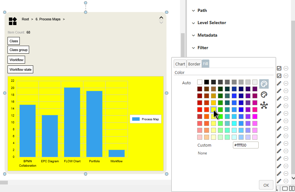
- Fill - It is also possible to influence the general coloring of each element. Similar to the Border-tab, the
Autobutton must be clicked first to activate further customizations. To undo the changes,Autocan be selected again at any time.
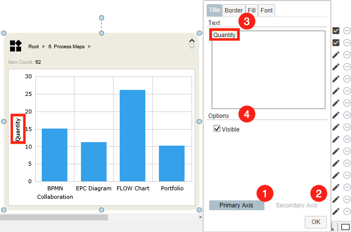
Title
This menu item allows you to freely decide how your chart should be named. The name will be displayed above the chart.
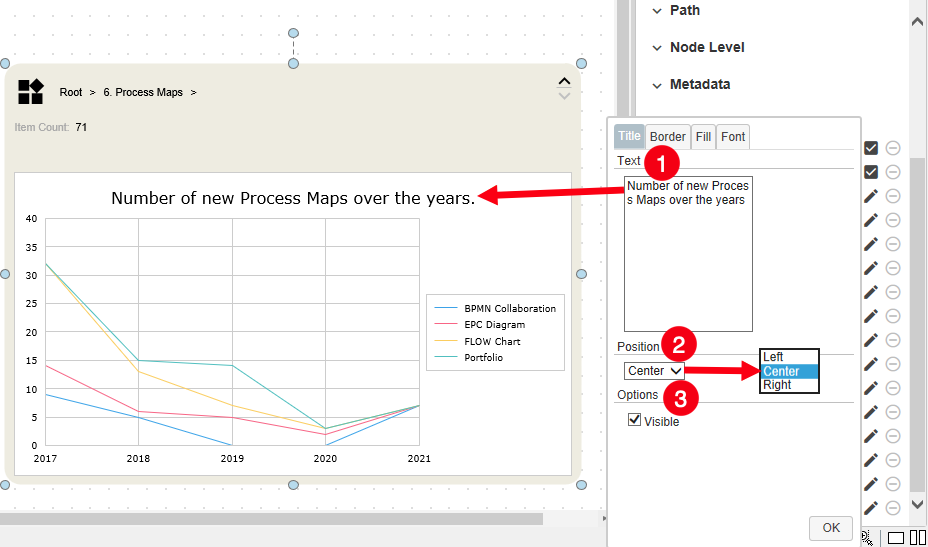
- Text - Enter here the name you have defined for the chart.
- Position - Here you can set the position of the chart name. This can be set as either left, center, or right.
- Visible - This item must be activated so that the name you assign is displayed at all.
Legend
The legend is the text box that describes the properties according to which the objects of the view are divided.
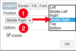
- Position - Here you can specify the location of the legend. It can be set as either Left, Middle Left, Right, or Middle Right
- Visible - Determine if the legend should be visible at all.
Plot Area
The plot area is the space between the horizontal and vertical axes.
- Border - Creates a border around the whole plot area and lets you customize its appearance.
- Fill - Define the background color of the plot area
Series
This option enables you to select the display mode for a specific property.
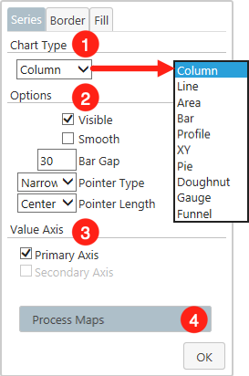
1. Chart Type - Select the chart type in which the desired property is to be displayed.
2. Options - Specify the exact display of the selected chart type
- Visible - If deselected, the chosen property will no longer be displayed.
- Smooth - Here you have the possibility to smooth the transitions between different values.
- Bar Gap - Specify the spacing between the individual bars.
- Pointer Type - This option is only useful if you have selected Gauge Pointer as the chart type. If this is the case, you can influence the appearance of the pointer here. Specifically, you have the choice between
Line,Narrowing Line, orArrow. - Pointer Length - This option is only useful if you have selected Gauge Pointer as the chart type. Set where the pointer of the chart should end. It can either be on the inner or outer edge, or in the middle of the chart.
3. Value Axis - If you have created a secondary Value Axis (see the Data Series section at the end of this article to learn how this works), you can specify here whether the changes should be oriented towards the primary or secondary axis.
- Primary Axis - The default axis, traditionally located on the left side of the chart.
- Secondary Axis - An optinal axis that must first be actively turned on in the Data Values section. It is usually located on the right side of the chart and can represent other numerical values.
4. Property - Set the property for which you want to change the chart type.
Series Label
This menu item is useful if you want to display the number of properties that are in a category.
- Visible - This item must be activated so that the labels are displayed at all.
- Property - Set the property for which you want to change the chart type.
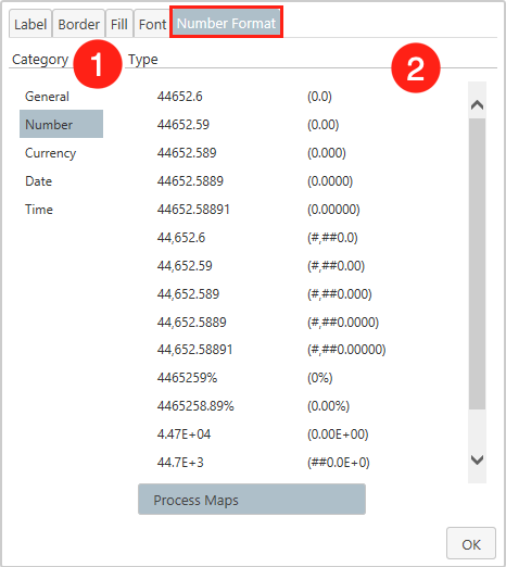
Depending on the context in which you are using your chart, a different display of the Series Label may be necessary. You can make this adjustment in the Number Format tab.
- Category - Choose the number category that fits your chart best. You can choose between
General,Number(This includes decimal points and percentages),Currency,DateandTimeformat. - Type - Depending on the previously selected number category, you can choose here the exact representation of the Series Label.
Category Axes
The Category Axes are the axes of the chart that runs horizontally. It has its name from the fact that in the normal case the individual categories are shown there, according to which the properties are sorted.
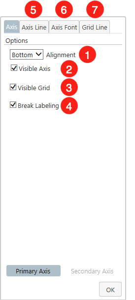
- Alignment - Determine whether the horizontal axis is displayed at the
Bottomor at theTopof the chart. - Visible Axis - Hides the horizontal axis completely.
- Visible Grid - Disables the vertical lines of the grid.
- Break Labeling - If the Category Axes labels are too long, a line break occurs by default. If you prefer the display in one line, you just have to uncheck this checkbox. But keep in mind that this might cause labels to overlap.
- Axis Line - Select the color of the category axis.
- Axis Font - Determine the appearance of the labels of the categories.
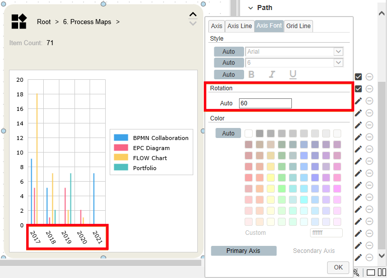
In addition to the already known options for text design, this menu item offers the possibility to determine the tilt of the labels of the Value Axis. This gives you the possibility to display significantly more labels.

7. Grid Line - Set the color of the vertical lines in the grid.
Category Axes Title
Similar to the previous menu item Title, which lets you determine a name for the whole charting area, this one enables you to name the horizontal axis.
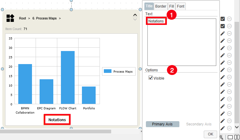
- Text - Enter here the name you have defined for the axis.
- Visible - This item must be activated so that the name you assign is displayed at all.
Value Axes
This section is about the configuration of the vertical axes. By default, the number of elements (Item Count) is mapped here. If you have created a secondary Value Axis (see the Data Series section at the end of this article to learn how this works), you can specify here whether the changes should apply to the primary or secondary axis.
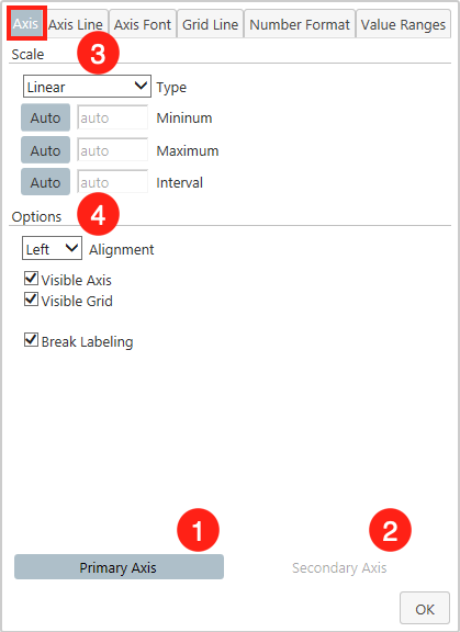
1. Primary Axis - The Primary Axis is located to the left of the Plot Area. When this button is selected, subsequent changes will apply to it. By default, the Primary Axis is selected.
2. Secondary Axis - When this button is clicked, you will have access to the secondary axis editing. This can be adjusted completely independently from the primary one.
3. Scale - In this section, you can make changes to the way the Value Axes work.
- Type - here you have the choice between three scale types. Linear, Logarithmic and Time.
- Minimum - Determine the starting point (lowest value) of the vertical axis. This can be especially helpful if you have a large number of objects in a view, but you only want to show the most important ones.
- Maximum - Set the endpoint (highest value) of the axis.
- Interval - Set the steps in which the values are to increase from the lowest to the highest. Please note that if you have selected Time as type, you can also specify spacing (quarterly, years, days, etc.) here.
4. Options - Make optical changes to the Value Axes.
- Alignment - Decide whether the horizontal axis should be displayed on the left or right side of the chart.
- Visible Axis - Select if the vertical axis should be visible at all.
- Visible Grid - Choose if the grid should include horizontal lines.
- Break Labeling - If the number to be displayed by the Value Axes, for example, if you have a lot of objects in a view, it may not fit in one row. If this item is enabled, the number will be wrapped to the next line in this case.

Value Ranges - In this tab, you can color certain value areas of a chart. This can be useful, for example, to highlight sustainable growth in a line chart, or to color customer satisfaction in a gauge pointer chart.
- Value Ranges - The display area of the already defined Value Ranges. to create a new one, you must use the
With a click on the +, you add new ranges.
- Options - Define where the value range should
Start,Towhere it goes and whatWidthit should have. - Color - With which color the selected range should be filled.
Value Axes Title
With this menu item, the value axes can be named. Please note, it is only possible to select the Secondary Axis if you have activated it in the previous menu item. Otherwise, as shown in the example, the Secondary Axis is grayed out. Keep in mind, before making any modifications, you should decide whether you want to make changes to the Primary or Secondary axis. When you select a different axis, the previously made changes disappear.
- Primary Axis - Give the left axis a name.
- Secondary Axis - Provide the right axis, if it exists, with a label.
- Text - Enter here the name you have defined for the axis.
- Visible - This item must be activated so that the name you assign is displayed at all.
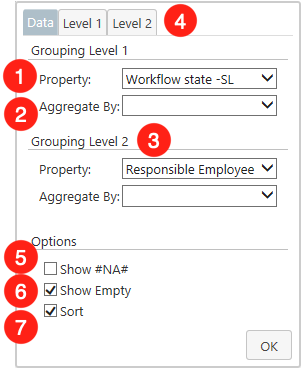
Data Series
The Data Series specifies the properties according to which the elements of the chart are to be separated. Examples of a Data Series are individual lines in a line chart or columns in a column chart. When multiple data series are plotted in a chart, each data series is identified by a unique color or shading pattern.
1. Property - The field next to the Property label can be considered as the main feature of the window. Clicking the field will open a list of every property definition included in your vault. When selecting a property definition you have two possible approaches. They can be selected either directly, or in relation to an object type. Therefore, the list is divided into different segments, which are signaled by bold headings.

- Direct - If a property definition from the direct category is selected, the elements will be sorted regardless of their object type. By default, the elements are grouped according to their object class. However, if you want to display all objects in a single category, you have to select the top entry
Wildcardof the dropdown menu.Another interesting entry is the propertyObject FileType. If there are documents in the selected view, this property causes the documents to be sorted according to their file types. For simplification, the icons corresponding to the file type (E.g.: Word. PowerPoint, Excel, etc.) are displayed directly. - Relation to an Object Type - If a property definition is selected in relation to an object type, only the elements that correspond to the object type are sorted. All others are displayed in the category #na#.
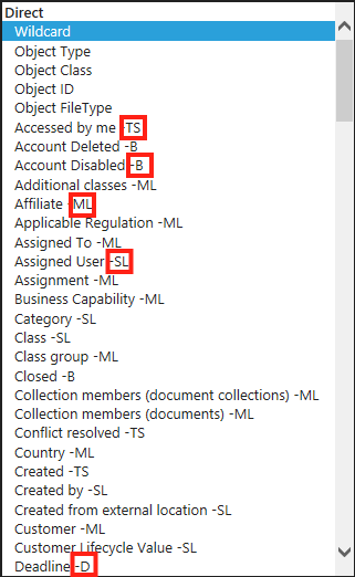
You may have noticed that some properties have abbreviations after their names. These indicate the type of property. In the following, these will be briefly explained for a better understanding.
- TS = Timestamp - These properties are assigned by the system itself and refer to an exact point in time. This includes, for example, the creation time of an object, or when it was last edited.
- B = Boolean - Hereby properties are covered, which can take two predefined states. Mostly these are expressed by Yes/No.
- ML = Multiselect List - If one or more values of a property can be selected from a predefined list, they are covered here.
- SL = Singleselect List - Similar to ML, but here only one value can be selected from a predefined list.
- D = Date - Properties in this category contain dates that can be independently entered by users.
2. Aggregated By - If you have previously selected a property of the type TS or D, you can specify here the time period to be covered by a single category. You have the choice between Year, Month, Year & Month and Date.
3. Grouping Level 2 - In addition to the first grouping level, you can define another one here. The configuration works in the same way as described above.
4. Level - If the property you have selected consists of a value list (MS or SL), the Level tab is activated. In this tab, you can reduce the considered M-Files objects to certain aspects of the value list and change the order of the groupings.
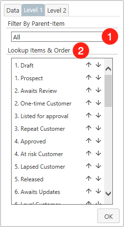
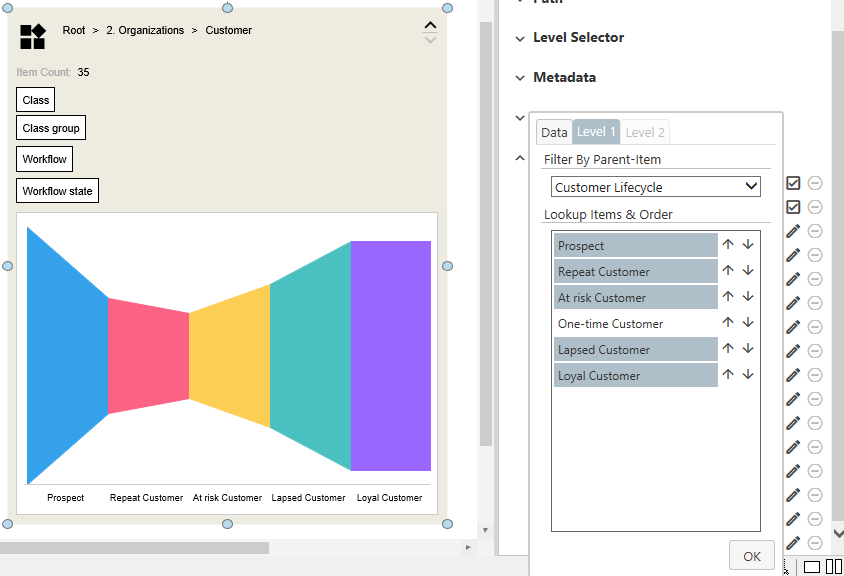
1. Filter By Parent-Item - If there is a Parent-Item for the property you have selected, as is the case for workflow states, for example, you can select it here and thus reduce the list. If the selected property has no parent items, this search bar will be hidden.
2. Lookup Items & Order - This list contains all values that are included in the selected property. Please note that this is a listing of all values that refer to the selected property, not only those that are actually used in the chart. For example, if you have selected the Workflow State property, all workflow states of the entire vault will be displayed here. Furthermore, you are able to:
- Select individual values with a mouse click that should be included in the chart. If you have not yet selected a value, all of them will still be displayed. As soon as you have selected a value, only those with a gray background are used in the chart.
- change the order in which the values are displayed in the chart. with the arrows (
↑/↓) you can freely determine the ordering.
5. Show #NA# - As mentioned above, items that do not match a certain criterion are listed with #na#. If you rather prefer complete hiding of these, this checkbox must be deselected.
6. Show Empty - The objects of the Smart Node that do not contain the selected properties will be summarized under EMPTY. If you deselect this item, it will be hidden completely.
7. Sort - By default, the elements of a Smart Node are sorted alphabetically. If you are not satisfied with this, sorting can be deselected here.
Data Categories
Here you can set the division of the axis, which divides the elements into categories. In the Column, Line Area, Funnel Horizontal, and Funnel Horizontal charts, this is the horizontal axis. The vertical axis, on the other hand, is influenced by the Bar, Profile, and Funnel charts. In the Pie and Doughnut charts, the individual segments are changed. The settings that can be made are the same as those already described in the Data Series section.
Although the Data Categories dialog does not differ from the Data Series, the Level tab should be discussed again here. Because this can be very helpful here.
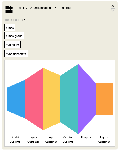
Think, for example, of the creation of a sales funnel. You have created customers in M-Files that are in a workflow according to their Customer Lifecycle. However, the individual workflow states are not numbered and not just sorted alphabetically. therefore, the arrangement in the chart does not make sense.
Now, in the Level Tab, you can, on the one hand, arrange the individual states in a meaningful way and limit them only to the most important ones.
Data Value
Here you can influence which values the Value Axis should display.
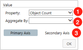
- Property - Set the property against which your objects will be measured. By default, your content is aggregated by the
Object Count. Furthermore, the dropdown list contains every property of your vault that refers to numeric values. Besides Timestamp (TS) and Date (D), which have been explained before, there are other property types that can be used.
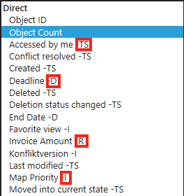
- R = Real - Any property that refers to real numbers falls under this category. These can be e.g. invoices.
- I = Integer - Properties that deal with integer values have this abbreviation. Normally, a user can define a number independently, but it must be in a previously defined range of values.
- Aggregated By - Define how the numbers of the properties should interact with each other. If you have selected a property of the type R or I, you can either let a
Summationof the values take place, build theMedian, or show theMinimumandMaximum. This is especially useful when you link views that deal with accounting. - Secondary Axis - As described in previous sections, it is also possible to create a secondary value axis. To set this up, a property must be set after clicking on the
Secondary Axisbutton.
Size
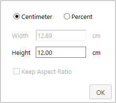
- Size - Unlike the others, Smart Nodes for Charting allow their height to be changed. This can be freely determined via the
Sizemenu item. You can either specify the desired size in centimeters or make a change in percentages.
Inject View Paths into Smart Nodes for Charting

It is also possible to inject views via command into a Smart Node for Charting. To do this, another element on the chart must be provided with the appropriate command. If this is triggered, the Smart Node is filled with the view. This is especially useful if you want to cover a large number of different views on your map and work as performance efficiently as possible. How to create this command can be read here.