

meta data for this page
Smart Nodes for M-Files Objects
Smart Nodes for M-Files Objects are designed to provide the user with extensive information about the linked object. With their predefined structure, they are easy to use and show all the necessary details.
You can either link a specific M-Files object to a Smart Node or display the data of a dynamically associated Object. When dropping a Smart Node from the library onto the canvas of a Workflow Map (see Create Workflow Maps) it will automatically fill itself with an Associated Object property. In short, this means that the content of the Smart Node changes depending on the object from which the Workflow Map is displayed. In addition, via the Properties menu, you can also specify that the Smart Node can use the data of its own Process Map. If you wish to learn more about Associated Objects click here (Working with Associated Objects).
Where to find Smart Nodes for M-Files Objects
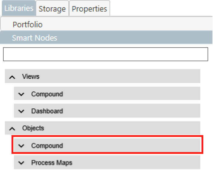
- Smart Nodes for M-Files Objects can be found in the Smart Node library in the
Compoundtab of theObjectscategory. - Three different Smart Node types can be found in the opened Compound Tab.
- If you want to learn more about the general use of the Smart Node Library, click here.
Types
There are three different types of Smart Nodes for M-Files objects.
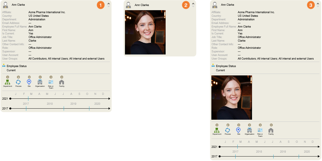
- The Metadata Smart Node contains various information about the linked object. In example, the user gets an overview of the most important metadata of his colleague, Ann Clarke. He knows directly in which workflows and processes she is involved. In addition, the timelines make it possible to logically trace when changes were made to her profile.
- The Image Smart Node provides access to the first related image (*.png, *.jpg, *.svg) of the object. If you connect a Process Map to the Smart Node, a preview of the drawing will be shown as the picture.
- The third one contains a mixture of the Metadata- and Image Smart Node. This understandably contains the most information, but also requires the most space for the display. This Smart Node should therefore only be used if there is sufficient space for possible spreads.
Structure & Functions
As described above, the Metadata- and Image Smart Node contains all the information and interaction capabilities of the other Smart Nodes described here. That's why the following section will only deal with this Smart Node.
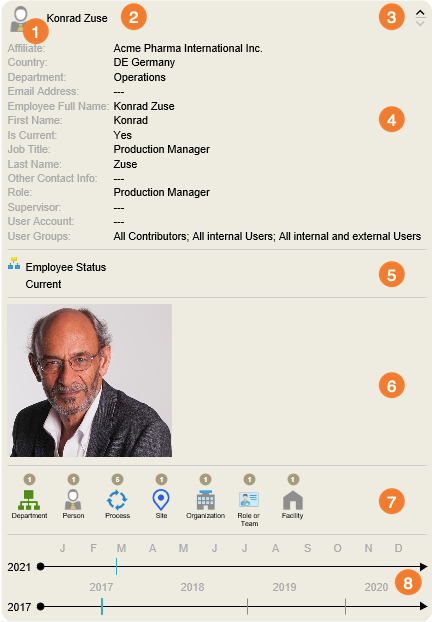
- Icon - The small picture in the upper left corner of the Smart Node is predefined by the symbol of the selected M-Files object.
- Title - The name of the linked M-Files object is displayed here.
- Level Selector - By clicking on the down arrow
∨, the Smart node is extended by one section. Clicking on the up arrow∧will reduce the size of the Smart Node by one section. In case either the maximum or minimum height of the Smart Node is reached, the affected arrow will change its color. - Metacard - The typical metadata card of an M-Files object is shown here.
- Workflow - This section provides the user with a list of workflows in which the linked object is located and in which state the object is currently.
- Linked Picture or Process Map - If a picture is linked to the connected object it will be shown in this section. This can be very useful e.g. when connecting user profiles to the Smart Node. In case the Smart Node contains a Process Map a preview will be shown in this section.
- Relations - This area lists other M-Files objects that have a connection to or from the object. The listed objects are bundled by their class. In the preview tab, a list of all included items will appear when you move your mouse over an icon.
- Activities - The two timelines arrange the changes made to the linked object by time. These are represented by vertical strokes. The upper timeline shows the changes made in the current year. The one below shows events in previous years. Clicking on a stroke opens a list with all activities of the linked object (History).
Customizing Smart Nodes for M-Files Objects
The following part deals with the personalization of the previously described sections of the Smart Node. These can be customized using the Properties menu.

1. Title - This item deals with the representation of the name or title of the linked M-Files object.
- Active - De-/Activate the functionality
- Font - Similar to other text blocks, the name or title of an M-Files object can also be edited. More precisely, the size, color and style of the font can be changed here.
2. Level Selector - Here you can customize the appearance of the buttons to expand ∧ or shrink ∨ the Smart Node.
- Active - De-/Activate the functionality
- Disabled Color - A button is deactivated when the Smart Node can not be expanded/shrank in its direction. The color it should assume in this state can be set here.
- Enabled Color - Conversely, if a Smart Node can be expanded/shrank in the direction of the button, it also takes on a specific color. This color can be determined here.
3. Metacard
- Active - De-/Activate the functionality
- Alignment - This menu item gives you the possibility to select the indent of the metacard. You have the choice between left, centered, or right-aligned.
- Show Titles - Here you can define whether the titles of the metadata (Affiliate, Country, etc.) are displayed or only their values.
- Style - You have the choice between displaying the metacard in
tabularform or as acontinuoustext. - Title Font - Change the appearance of the font of the metadata title.
- Value Font - Change the appearance of the font of the metadata values.
4. Workflow
- Active - De-/Activate the functionality
- Alignment - Here you can change the alignment of the workflow data. You have the choice between left, centered, or right-aligned.
- Show Titles - Here you can define whether the titles of the metadata (Affiliate, Country, etc.) are displayed or only their values.
- State Font - Change the appearance of the font of the workflow states.
- Workflow Font - Change the appearance of the font of the workflow name.
5. File Image
- Active - De-/Activate the functionality
- Alignment - Here you can change the alignment of the displayed image. You have the choice between left, centered, or right-aligned.
6. Relations
- Active - De-/Activate the functionality
- Type - For relations to other M-Files objects, a general distinction is made between relations
FromandTothe linked object.
From= relationships to objects that result from the object's own metadata (Department, Site, Facility).To= relationships that arise from the fact that a connection to the object of the Smart Node arises in the metadata of other objects (Supervisor, Process Owner, Manager).
- Grid - Determine the spacing between the individually listed elements in the lower area of the Smart Node. Both the horizontal and the vertical distance can be defined here with millimeter precision.
- Tile - Each of the listed elements is surrounded by a so-called Tile. The size of it can be influenced to the left, right, top, or bottom. By default, the color and border of the Tile is set to be invisible. To change that, you have to click the 'None' button and select the desired color.
- Counter - This menu item influences the appearance of the number above a category of listed elements. You can determine if the number should be visible at all, what the surrounding circle should look like and how the number itself should be displayed.
- Icon - This menu item deals with the display of the icons of the content area.
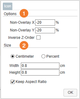
1. Options - The Options area can only be used if two properties have been previously set as Grouping Level. Here the positioning of the two icons can be determined, which is then used for this combination of properties.
- Non-Overlay X - Determine the horizontal distance between the two icons. The field accepts values between
-125and125. If negative values are entered, the icon of the first grouping level is displayed to the left of the second one. If positive, it will be displayed to the right. - Non-Overlay Y - Set the vertical distance between the two icons. The field accepts values between
-125and125. If negative values are entered, the icon of the first grouping level is displayed above the second one. If positive, it will be displayed below. - Inverse Z-Order - By default, the icon of the first Grouping Level property is displayed in front of the second one. By selecting this menu item, the order will be changed.
2. Size - set the size for all of the icons. If you deselect Keep Aspect Ratio, you can determine Width and Height independently from one another. You also have the choice between determining the size in centimeters or change it in percentages.
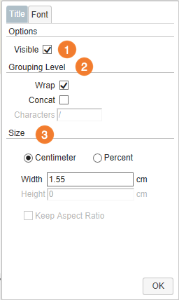
- Title - Customize the names of the elements displayed in the content area.

1. Visible - Determine if the names of the selected properties should be shown at all.
2. Grouping Level - If two Grouping Levels are specified, the arrangement of the labels can be set here.
- Wrap - By default, the labels are separated from each other with a line break.
- Concat - If you do not like the separation by line breaks, you can select this option. This will activate the Characters field. Here you can enter as many characters as you want to separate the labels from each other.
3. Size - Define the size of the title. Here you have the choice between changes in centimeters or percentages.

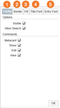
- Tooltip - This menu item lets you customize the list that pops up when you hover your mouse over one of the icons.

1. Tooltip - Customize the functionalities of the tooltip. Due to the wide variety of its options, they will be covered in more detail.
- Visible - Determine if the tooltip should pop up at all.
- Allow Search - Decide if searches can be triggered via the tooltip.
- Metacard - Disable the icon which calls up the meta data card of an object.
- Show - Disable the icon to perform a search for a single item.
- Edit - Disable the icon to edit a document.
- View - Disable the icon to view a document.
2. Border - Select the color of the border of the tooltip.
3. Fill - Set the color of the tooltip's background.
4. Title Font - Change the appearance of the tooltip's title.
5. Entry Font - Determine the font style and color of the names of elements listed in the tooltip.
- Grouping Level - Here you can specify the criteria according to which the related M-Files objects are to be grouped and sorted. When clicking this menu item, a window will open. In general, you can define up to two Grouping Levels.
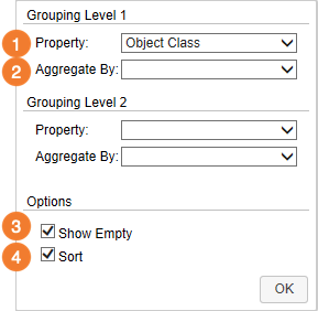
- Property - The field next to the Property label can be considered as the main feature of the window. Clicking the field will open a list of every property definition included in your vault. When selecting a property definition you have two possible approaches. They can be selected either directly, or in relation to an object type. Therefore, the list is divided into different segments, which are signaled by bold headings. If a property definition is selected in relation to an object type, only the elements that correspond to the object type are sorted. All others are displayed in the category #na#. If, on the other hand, a property definition from the direct category is selected, the elements will be sorted regardless of their object type. By default, the elements are grouped according to their object class.
- Aggregate By - Some property definitions sort the elements by specific dates. Here you can define how fine this sorting should be done. The selection reaches here from the distinction of the years, up to minute-exact data.
- Show Empty - As mentioned above, items that do not match a certain criterion are listed with #na#. If you rather prefer a complete hiding of these, this checkbox must be deselected.
- Sort - By default, the elements of a Smart Node are sorted alphabetically. If you are not satisfied with this, sorting can be deselected here.

7. History this/Year before - Please note that you can customize the sections History This Year and History Years Before independently from one another. However, since these offer the same setting options, they are treated together below
- Active - De-/Activate the functionality
- Entry Color - Set the color of the vertical strokes.
- Scale Color - Choose the color of the timeline.
- Scale Font - Determine the appearance of the different sections of the timeline (Months/Years)
- Title Font - Select the appearance of the year in front of the timeline.