Table of Contents
Workload Charts and Gauges
The idea of workload charts is to give an overview of the tasks at hand. While the M-Files Client always displays the “assigned to me” tasks and content on the home page, this is always the user's perspective on the workload. It shows what is waiting for you as the currently logged in user. To see other aspects, such as the workload of your colleagues, differentiation by time, object class or urgency/priority, you need to click into different views, aggregate and sort a bit. That's where workload charts and 'View Smart Nodes' offer a whole new level of clarity.
Let's face it, for looking at the workload of an employee, a department or a specific process, most of the time you are looking at smaller sets of objects or documents. We are talking about quantities that run into the hundreds, at most into the thousands of objects. M-Files can excellently handle this number of objects in its queries.
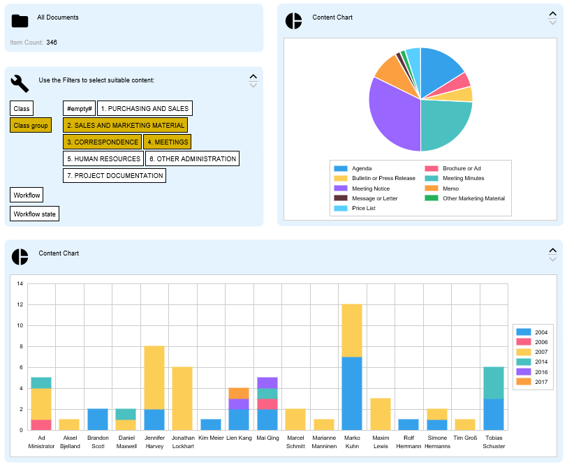
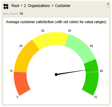
The client-server nature of M-Files with its caching capabilities is perfect for processing the metadata and objects quickly and efficiently. For this reason, it is also possible to further process the queries graphically in the client, either as a bar, pie or line chart or as an aggregated hit list with icons that can be accessed directly with the mouse.
But even here the possibilities do not stop. Thanks to the Smart Nodes for Dashboarding you are able to quickly and efficiently display the data of a single M-Files view in multiple display formats. To do this, you link an M-Files view to just a single root Smart Node, which then passes the resulting data to any number of Smart Nodes. With the combination of both Smart Nodes for Views and Smart Nodes for Charting, you get a powerful tool that gives your users deep insight into your chosen data set.
Let us look at some of the advantages:
- See more than one perspective in parallel in separate charts or using the series function, which repeats a chart by iteration over a list.
- Use what you have and what you know already: Model charts using the traditional M-Files concepts of views, metadata, value lists, workflows as well as grouping and aggregation by metadata. Work off your existing views.
- See the content of multiple views at the same time. Sending receiving and interpreting the queries and presenting it for consumption in one map is faster and way more effective than traveling around into different views one after the other.
- Use the Dashboard function, in which only one root Smart Node is needed to forward the data from a single view to multiple Smart Nodes. This allows you to combine different Smart Nodes and exchange the underlying data set quickly and conveniently.
- We offer such functions, even though we know, that it may take a couple of seconds. But the simplicity and direct access to the results is a tremendous benefit.
- Navigate with one click: View based Smart Nodes can jump to views and subviews with one click. Also, you can open another M-Files window (Desktop) with the results of a query.
- Inspect (hover over) the aggregated chart elements. The mouse-over tooltip shows you a list of objects/documents and allows to open/edit/show them right away.
- With a click onto a symbol or shape you can ingest a view into a Smart Node. This allows to look at one set of charts from different perspectives. Also the ‘Hierarchy Walker Smart Node’ can be initiated with the desired content.
Take a look at the following articles to learn more about the integral parts of Workload Charts:
Note: Workload charts are not BI.
- Workload charts are not a business intelligence or reporting tool. The output of lists, crosstabs and the arbitrary linking with external data sources is not possible and is not available by design. There are many BI and reporting solutions available for that. Microsoft reporting services, power BI, Tableaux, ClikView etc can be integrated with M-Files and they can complement the workload charts, mentioned here.
- Workload charts can only work quickly with a maximum of 4-digit object sets. They are rendered completely in the client. Server-side preparation of comprehensive evaluations, even of large amounts of data, is not possible (at present).

