

meta data for this page
Smart Nodes for M-Files Views
Smart Nodes for M-Files Views allow to evaluate the content of M-Files views and display them within a process map. Since you can have multiple Smart Nodes in a map, you can browse your entire view structure in a clear way and see it all at one glance. In particular new employees will benefit from this newly gained transparency.
Where to find Smart Nodes for M-Files Views
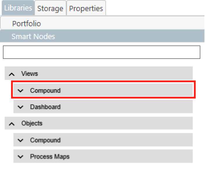
- Smart Nodes for M-Files Views can be found in the Smart Node library in the
Compoundtab of theViewscategory. - When this tab is expanded, you will find four different Smart Nodes for M-Files Views at the top of it.
- If you want to learn more about the general use of the Smart Node Library, click here.
Common Features
Smart Nodes for M-Files views share the following capabilities:
- When the icon of a Smart Node is clicked, it is reloaded. Smart Nodes that allow expanding the view path are also reset to the initial status after loading. (This can be disabled in the Properties menu path: Smart Node > Icon > Allow Reset).
- Clicking on the view name in the preview triggers a jump to the view in the M-Files Client. It displays the content of the view in the shell listing on the left.
- By default, objects in the selected view are displayed or virtual folders that are contained in it.
- Since Smart Nodes for views do query data, the limits for the query can be defined. This allows for speed optimization.
Variations & Functions
There are four different variants of Smart Nodes for M-Files Views. Please be aware that this section only covers the default functionalities of the specific Smart Node. The adjustments that can be made via the Property menu are covered further down below.
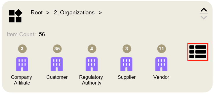
Vault-View
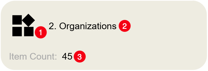
The simplest representation of a view, that provides you with its basic attributes. It provides the user with:
- Icon (with the reset function)
- The name of the connected view (when clicked - launches the view in the shell listing)
- Number of items it contains (if you see round numbers like 250 or 500 this indicates that you probably have more records, but the limits for the query apply)
To not overload your server, by default the number of contained objects is limited to 250. However, the maximum number can be changed in the properties. The exact procedure will be explained in more detail later in this article.
This display method is particularly useful if as many views as possible should be applied to the Process Map. Thanks to its compact appearance, it is very useful as part of a complete overview of all views of your vault.
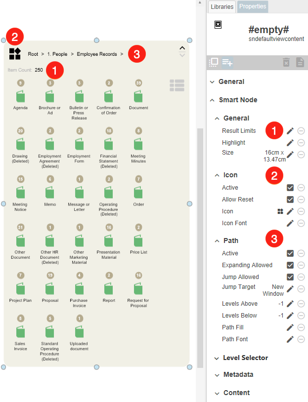
Vault-View with Content
This Smart Node is the logical extension of the previous one. In addition to the capabilities of the Vault-View Smart Node, the Vault-View with Content Smart Node can also:
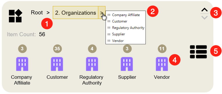
1. Specify the path of the connected view.
2. Extend the view path.
3. Extend or shrink the whole Smart Node.
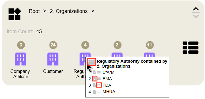
4. List the individual objects, sort them by their object type and identify them by predefined icons. If you hover your mouse over an icon, a list of all the objects contained in the category will open.
This list offers you three different interaction possibilities:
- trigger a search that results in the display of all related elements
- open the meta data card of a specific element
- trigger a search that only results in the display of one specific item
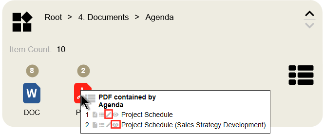
When you select a document, you also have the option of editing and viewing.
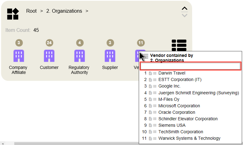
If a category contains more than ten M-Files objects, a search bar is displayed by default in the tooltip, which allows the user to search specifically for contained objects.
5. Trigger a search that returns the items in the view when clicking this icon in the preview tab.
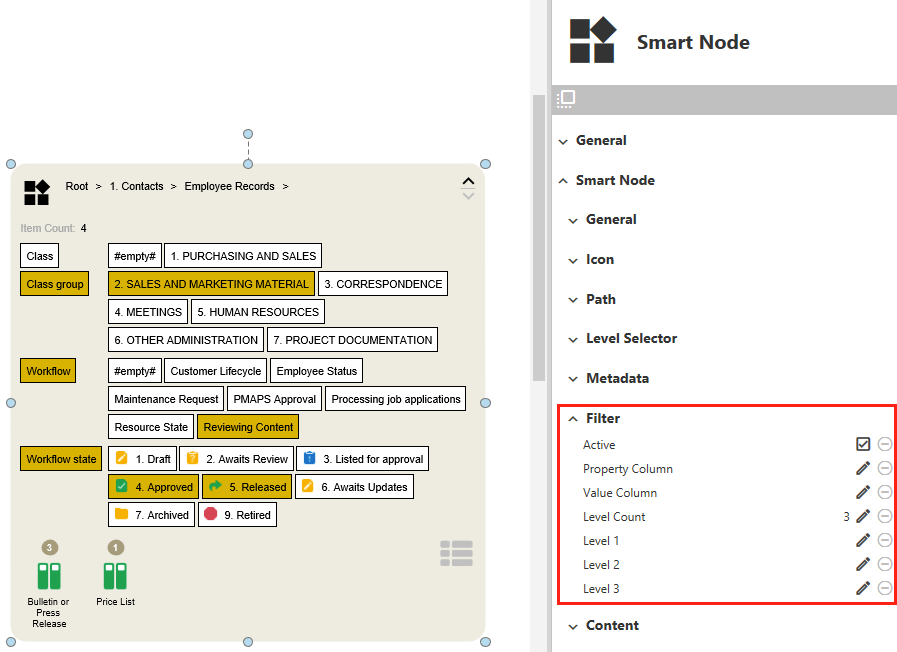
Vault-View with Filter and Content
This Smart Node has the additional function to filter the displayed objects of a view. For this, you can choose the properties and the values which are to be used for filtering. Do not be confused by the fact that only the properties are displayed by default. When one of the properties is selected, the corresponding values will appear. And please note that the properties and filter levels can be freely chosen. But the default comes up with properties that work on any vault structure.
- Use the Property Column, to select the desired properties according to which the objects in the content area are to be filtered. By default you have the choice between the properties
Class,Class group,WorkflowandWorkflow statewhich are even dependent on each other as a hierarchy. - The Value Column provides corresponding values to the selected property. It's important to note that the Value Column appears only when a Property is selected. So, don't worry if it doesn't show up initially when you first use the Smart Node. Clicking on a value will filter the displayed objects in the content area accordingly. Additionally, you have the option to predefine and limit the entries shown here for better management.
Vault-View with Level-Walker

Using this Smart Node is especially useful if you expect users to jump through different levels of the linked view. The Level Walker makes this a breeze. In addition, this Smart Node also supports the filtering functionalities. By default filters for this Smart Node have been configured to show as drop-downs. But you can activate the tiled filters, if you like.
You may have already observed that you can choose different display formats for both the property and value columns of the filter. In this example, the Workflow property is shown as Tiled, while the corresponding values are displayed as a dropdown (Select). Instructions on how to configure this are provided later in this article.
- The sections on the left side are called Property Columns. They serve as filters for the M-Files objects displayed in the lower pane. When a column is expanded, a list of properties within your vault will open. Simply select the ones you require. Instructions on how to do this will be provided later.
- On the right side are the Value Columns. These can only be used if an entry from the Property Column has been selected previously. Depending on the selected property, different values are displayed.
- The Level-Walker is a comfortable way of switching freely between the different view levels.
- When you click on this icon, the Smart Node jumps back one level.
- This button brings you back to the first view level of your Smart Node.
Customizing Smart Nodes for M-Files Views
Using the properties menu you have a wide range of possibilities to customize the Smart Nodes according to your needs.
These articles start with the Smart Node with the fewest setting options and end with the one with the most. Please note that the individual sections are build on each other. This means, for example, that the Smart Node Vault-View with Content offers not only the properties that are in its section but also all the preceding ones.
General Properties
This section contains properties that are customizable for all Smart Nodes for M-Files Views.
1. Result Limits - Define the maximum number of objects to be displayed in the selected Smart Node. In order not to overload your Vault, a limit of 250 is set by default.
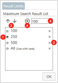
- Value Container - This container holds the values that are currently available for the user to choose from. If a value is clicked, it will be set as default. This is indicated by the filled star
★in front of a value. Please note, to display the changes, you have to close the dialog by clickingOK. - Delete Value - If you want to delete a value from the selection list, you have to click the cross next to it.
- Move Value - Move a selected value either one position up
↑or down↓in the list. Please note that the position in the list is also applied to the name filter on the Smart Node. - Add Value - To add a value, please enter the desired amount in the field to the right of the icons. To add the value to the list,
+must be clicked.
2. Icon
- Active - Deactivate the display of an icon.
- Allow Reset - By default, when you click the icon, the Smart Node is reset to its original state. If this is not desired, you can disable this behavior here.
- Icon - Select from a list of icons the one that matches your application field.
- Icon Font - If you want to change the size or color of the icon, this menu item can help you. Similar to labels, you can personalize the appearance of the icon here.
3. Path - This section is all about customizing the view path of the Smart Node.
- Active - If you do not want the name of the path to be visible, you can disable it here.
- Expanding Allowed - If it is undesirable that the user can move freely through the individual levels of a view, this function can be disabled here. This way you can define a fixed view that is inseparable from the Smart Node.
- Jump Allowed - Here you can specify whether the view should be broad up when you click on its name.
- Jump Target - If the previous item is enabled, you can specify here whether the view should be opened in a new window or in the same one.
- Levels Above - Set whether and how many previous levels of the selected view should be shown.
- Levels Below - Similar to Levels Above, except that here the underlying levels are addressed.
NOTE: If you set both previous menu items to -1 , the user will have access to any number of levels below and above the deployed view.
- Path Fill - This menu item can be used to specify a color tone with which the view path is to be highlighted. By default, the field
Noneis selected. To make more colorings selectable, this field must be clicked first. - Path Font - Like other text blocks, it is also possible to customize the font and color of the view path. If you need more information on how to customize the font of texts, you can find more information here.
Vault-View
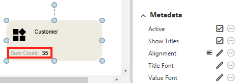
Metadata - The term Metadata refers to the section of the Smart Node which shows the number of objects included in the linked M-Files views. The following adjustments can be made via the Properties menu:
- Active - In case the number of M-Files objects is irrelevant to your users, you can disable it here.
- Alignment - This menu item gives you the possibility to select the alignment of the 'Item Count:…': Left-aligned, centered, or right-aligned can be selected.
- Show Titles - Here you can define whether the text 'Item Count' is to be displayed or only the number of objects is to be listed.
- Title Font - Of course, the display of this text can also be personalized. The process is the same as already described above.
- Value Font - Same functionality, but for the number of contained objects.
Vault-View with Content

1. Level Selector - Here you can customize the appearance of the buttons to expand ∧ or shrink ∨ the Smart Node.
- Active - De-/Activate the functionality
- Disabled Color - A button is disabled when the Smart Node can not be expanded/shrank in its direction. The color it should assume in this state can be set here.
- Enabled Color - Conversely, if a Smart Node can be expanded/shrank in the direction of the button, it also takes on a specific color. This color can be determined here.
2. Content - Here you can define if and how the objects of the linked view is displayed in the Smart Node and how the user should be able to interact with it.
- Active - De-/Activate the functionality
- Always show Content - Normally, only the elements that are directly in the selected view are listed. If there are sub-views in it, elements lying in them are not considered. If this menu item is activated, these elements are also displayed.
Note: Handle this function with extreme care. It could easily happen that you will face several thousand objects in the Smart Node. This can have an enormous influence on the performance of the map. So be aware of how many elements will be represented before this function is activated.
- Grid - Determine the spacing between the individually listed elements in the lower area of the Smart Node. Both the horizontal and the vertical distance can be defined here. Both the horizontal and the vertical distance can be defined here with millimeter precision.
- Tile - Each of the listed elements is surrounded by a so-called Tile. The size of it can be influenced to the left, right, top, or bottom. By default, the color and border of the Tile is set to be invisible. To change that, you have to click the
Nonebutton and select the desired color. - Counter - This menu item influences the appearance of the number above a category of listed elements. You can determine if the number should be visible at all, what the surrounding circle should look like and how the number itself should be displayed.
- Icon - This menu item deals with the display of the icons of the content area.
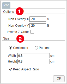
1. Options - The Options area can only be used if two properties have been previously set as Grouping Level. Here the positioning of the two icons can be determined, which is then used for this combination of properties.
- Non-Overlay X - Determine the horizontal distance between the two icons. The field accepts values between
-125and125. If negative values are entered, the icon of the first grouping level is displayed to the left of the second one. If positive, it will be displayed to the right. - Non-Overlay Y - Set the vertical distance between the two icons. The field accepts values between
-125and125. If negative values are entered, the icon of the first grouping level is displayed above the second one. If positive, it will be displayed below. - Inverse Z-Order - By default, the icon of the first Grouping Level property is displayed in front of the second one. By selecting this menu item, the order will be changed.
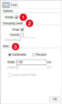
2. Size - set the size for all of the icons. If you deselect Keep Aspect Ratio, you can determine Width and Height independently from one another. You also have the choice between determining the size in centimeters or change it in percentages.

- Title - Customize the names of the elements displayed in the content area.
1. Visible - Determine if the names of the selected properties should be shown at all.
2. Grouping Level - If two Grouping Levels are specified, the arrangement of the labels can be set here.
- Wrap - By default, the labels are separated from each other with a line break.
- Concat - If you do not like the separation by line breaks, you can select this option. This will activate the Characters field. Here you can enter as many characters as you want to separate the labels from each other.
3. Size - Set the width of the labels under the icons. Here you have the choice between changes in centimeters or percentages. If the label of the icons is longer than the label size you set, the text will wrap.

- Name Filter - Here can be set if the user should be able to filter the objects of the Smart Node with a name search. Furthermore, it can also be set here whether the user should be able to change the result limit of the Smart Node.
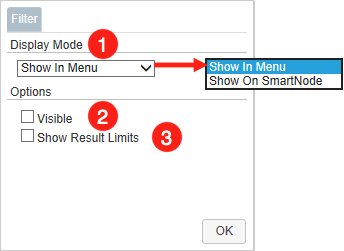
1. Display Mode - You have the choice of displaying the Name Filter either as an icon (Show In Menu), which can be used by a tooltip or directly in the upper area of the Smart Node (Show on Smart Node).
2. Visible - Determine if the Name Filter should be shown at all.
3. Show Result Limit - As mentioned at the beginning, the maximum number of contained items is limited to 250 by default. If you enable this item, the Name Filter will be extended by the item that allows the user to set the limit from predefined values.
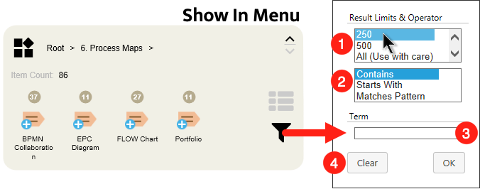
1. Result Limits - A list from which the user can determine the maximum number of results.
2. Search Settings - Set whether the name search should refer to all parts of the object names (Contains), or the beginning (Starts With). In addition, you can also select the Matches Pattern option for your search. This means that you can replace single characters of your search with the wildcards
*and?. If you need more information about this, please refer to the M-Files documentation.3. Search Term - Enter your search term here.
4. Clear - Set the filter back to its default state


- Menu - Determine the position of the icon that triggers a search of all objects of the Smart Node. This can be displayed either on the left (default) or right side.

- Tooltip - This menu item lets you customize the list that pops up when you hover your mouse over one of the icons.
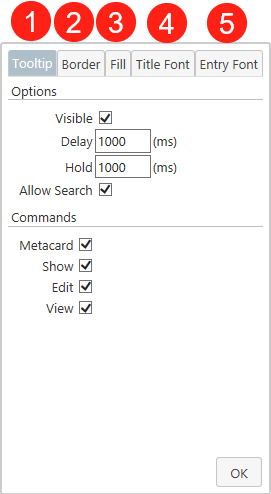
1. Tooltip - Customize the functionalities of the tooltip. Due to the wide variety of its options, they will be covered in more detail.
- Visible - Determine if the tooltip should pop up at all.
- Delay - Specify the duration (in milliseconds) for which the mouse cursor should hover over a category before the tooltip appears.
- Hold - Determine the duration (in milliseconds) for which an open tooltip remains displayed after the mouse is moved away from the category.
- Allow Search - Decide if searches can be triggered via the tooltip.
- Metacard - Disable the icon which calls up the meta data card of an object.
- Show - Disable the icon to perform a search for a single item.
- Edit - Disable the icon to edit a document.
- View - Disable the icon to view a document.
2. Border - Select the color of the border of the tooltip.
3. Fill - Set the color of the tooltip's background.
4. Title Font - Change the appearance of the tooltip's title.
5. Entry Font - Determine the font style and color of the names of elements listed in the tooltip.

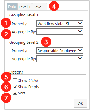
- Grouping Level - Here you can specify the criteria according to which the elements included in the view are to be grouped and sorted. When clicking this menu item, a window will open. In general, you can define up to two Grouping Levels.

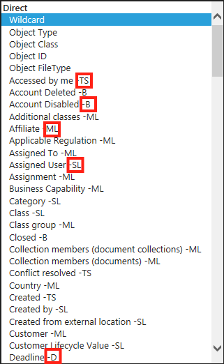
1. Property - The field next to the Property label can be considered as the main feature of the window. Clicking the field will open a list of every property definition included in your vault. When selecting a property definition you have two possible approaches. They can be selected either directly, or in relation to an object type. Therefore, the list is divided into different segments, which are signaled by bold headings.
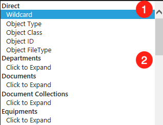
- Direct - If a property definition from the direct category is selected, the elements will be sorted regardless of their object type. By default, the elements are grouped according to their object class. However, if you want to display all objects in a single category, you have to select the top entry
Wildcardof the dropdown menu.Another interesting entry is the propertyObject FileType. If there are documents in the selected view, this property causes the documents to be sorted according to their file types. For simplification, the icons corresponding to the file type (E.g.: Word. PowerPoint, Excel, etc.) are displayed directly. - Relation to an Object Type - If a property definition is selected in relation to an object type, only the elements that correspond to the object type are sorted. All others are displayed in the category #na#.

You may have noticed that some properties have abbreviations after their names. These indicate the type of property. In the following, these will be briefly explained for a better understanding.
- TS = Timestamp - These properties are assigned by the system itself and refer to an exact point in time. This includes, for example, the creation time of an object, or when it was last edited.
- B = Boolean - Hereby properties are covered, which can take two predefined states. Mostly these are expressed by Yes/No.
- ML = Multiselect List - If one or more values of a property can be selected from a predefined list, they are covered here.
- SL = Singleselect List - Similar to ML, but here only one value can be selected from a predefined list.
- D = Date - Properties in this category contain dates that can be independently entered by users.
2. Aggregated By - If you have previously selected a property of the type TS or D, you can specify here the time period to be covered by a single category. You have the choice between
Year,Month,Year & MonthandDate.3. Grouping Level 2 - In addition to the first grouping level, you can define another one here. The configuration works in the same way as described above.
4. Level - If the property you have selected consists of a value list (
MSorSL), the Level tab is activated. In this tab, you can reduce the considered M-Files objects to certain aspects of the value list and change the order of the groupings.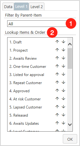
1. Filter By Parent-Item - If there is a Parent-Item for the property you have selected, as is the case for workflow states, for example, you can select it here and thus reduce the list. If the selected property has no parent items, this search bar will be hidden.
2. Lookup Items & Order - This list contains all values that are included in the selected property. Please note that this is a listing of all values that refer to the selected property, not only those that are actually used in the chart. For example, if you have selected the Workflow State property, all workflow states of the entire vault will be displayed here. Furthermore, you are able to:
- Select individual values with a mouse click that should be included in the chart. If you have not yet selected a value, all of them will still be displayed. As soon as you have selected a value, only those with a gray background are used in the chart.
- change the order in which the values are displayed in the chart. with the arrows (
↑/↓) you can freely determine the ordering.
5. Show #NA# - As mentioned above, items that do not match a certain criterion are listed with #na#. If you rather prefer complete hiding of these, this checkbox must be deselected.
6. Show Empty - The objects of the Smart Node that do not contain the selected properties will be summarized under
EMPTY. If you deselect this item, it will be hidden completely.7. Sort - By default, the elements of a Smart Node are sorted alphabetically. If you are not satisfied with this, sorting can be deselected here.


Vault-View with Filter and Content
Filter
- Active - De-/Activate the functionality
- Property Column - This entry contains settings for the customization of the property columns:

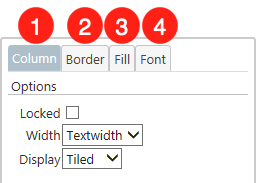
1. Column - Customize the functionalities of the column. Due to the wide variety of its options, they will be covered in more detail.
- Locked - If activated, the property columns can not be expanded. This can be helpful if you want to specify a certain property for your users, which should always be used for filtering.
- Width - Defines how the property columns should behave if the property title is longer than the width of the field. Auto: Titles that are too long will get a line break. Textwidth: The width of the field adapts dynamically to the length of the title.
- Display - You have the choice of how your personal properties should be displayed. Select: You choose your properties from a scrollable list. Tiled: The properties are displayed as a clickable tile.
2. Border - Select the color of the border of the column.
3. Fill - Set the color of the column's background.
4. Font - Determine the font style and color of the displayed properties within the filter.
- Value Column - All the settings described above for the property columns are also applicable to the value columns.
- Level Count - You have the possibility to set as many filters as you like for this Smart Node. Simply enter your desired number in this field.
- Level - Select - Depending on how many filters you have set with the previous menu item, the number of these entries will change. Here you can define which properties and associated values appear in a specific filter row. When clicked, a list of all possible properties defined by your vault will appear.

- List Elements - Specify from which properties the users can select later. All properties with a blue highlight are accessible via the Smart Node. This option is especially useful if you have previously selected Tiled as the display format.
- Value - With a click on the entry
Value, you can restrict the values which are associated with the selected properties. The dialog is shown in the following picture.

- Options - Select Allow Empty if the entry
#empty#should appear in the Value List. If a user selects#empty#as a value to filter by, only M-Files objects that contain the previously selected property, but do not have a value set for it, will be considered. Select Allow Deleted to display values which have been deleted at some point in your system. You can identify them by the tag(deleted)displayed behind their name. By default, this option is disabled
- Property Selection - If you have specified multiple properties for a filter, you can select here for which you want to limit the values.
- Value List - In this list you will find the corresponding values for the selected property.

Apart from that, there are some peculiarities when you have selected a temporal property. This can be, for example, the creation date, last edited or due dates of certain projects. More generally speaking, this concerns every property of the type TS (Timestamp) and D (Date)
- Use Today as Opposite Limit - If this option is enabled, the filter selection will be limited to dates in the future (Days From Today) only. This should be applied if you are looking for e.g. future due dates of projects or expiration dates of legal documents.
- Time Interval - Determine in which time intervals you want to filter. Basically, you should know that today's date is always taken as the starting point. Furthermore, we distinguish between the possibilities to filter
To, orFromtoday's date.Tomeans that an interval is formed into the past. This should be used to search for e.g. publication dates of documents.From, on the other hand, builds an interval into the future. This is useful e.g. if you have selected due dates of projects as property. Besides days, you can also filter by months or years. - Time Period - Depending on the interval you have previously selected, you can see here the exact period of time that users can filter by. Like conventional values, these can also be limited.
- Level - Column - In this tab of the Level dialog, you can specify the display format of the selected filter. Here, you have the option to choose between the Tiled and Select display formats for both the property and the value column.

- Display Options - Specify the display format of the property column. To be able to edit this entry, you must first deselect
Auto. - Value - Click on the entry
Valueto switch to the customization options for the value column.

- Width - If you've chosen
Tiledas the display format for your Value Column, you can utilize this option to specify how the individual values should be arranged. If “Auto” is selected, as many values are displayed side by side as the width of the smart node permits. However, if “Textwidth” is chosen, the entries are displayed one below the other. - Display Options - Specify the display format of the value column. To be able to edit this entry, you must first deselect
Auto.
Vault-View with Level-Walker

View Level
- Active - De-/Activate the functionality
- Visible Rows - Here you can define how many rows the levels of the Level Walker should display. The height of the Smart Node can also be influenced in this way. By default, a Smart Node will display 10 rows. The height of the Smart Node can also be influenced in this way.
- Show Results - This option provides the functionality such that when you open the process map in your M-Files Vault and navigate through the views in your Smart Node, the selected views automatically open on the left-hand side.
- Title Font - This allows you to change the individual level names in font, font style, and color.
- Entry Font - Let you customize the designation of the items within the Level-Walker.
Inject View Paths into Smart Nodes for M-Files Views

It is also possible to inject views via command into a Smart Node for M-Files Views. To do this, another element on the map must be provided with the appropriate command. If this is triggered, the Smart Node is filled with the specified view. This is especially useful if you want to cover a large number of different views on your map and work as performance efficiently as possible. How to create this command can be read here.